Ready for 2022

December 30, 2021

Normally, I make my yearly “smash books” from scratch, but when I stopped in Joann Fabrics a couple days ago to grab some paper for an upcoming project, I ran across an aisle of planners and supplies, and all the “Happy Planner” brand were 30% off.

I had already decided to go again with a tiger theme as I did last year (I ‘ve been obsessed with tigers ever since touring Big Cat Rescue in Tampa a few years ago), and it so happens that 2022 is the Chinese Year of the Tiger. Sweet! Lots of amazing graphics are out there to now enhance my book. When I spotted this planner, dubbed “Neutral Jungle”, the possibilities started to whirl! Not only do the inside pages have tabs for each month (how I love tabs!), but they are decorated in a wildcat theme. Perfect!

The tab pages are sturdy and have wonderful graphics.

The book is bound with plastic rings, so you can easily remove/rearrange the pages. I will very likely remove quite a few to allow for expansion as I paste in photos, ticket stubs, receipts, greeting cards and other ephemera throughout the year. My books always end up at least 1-1/2″ to 2″ thick!

Of course, the cover was far too plain for my liking. My motto is, has been and always will be: More is more. If it doesn’t contain everything and the kitchen sink, it’s not finished. Also, glitter and flowers must be involved.

I sanded the laminated cover, painted it teal and dabbed an orange-y glitter paint around the perimeter. Onto this I glued a couple layers of paper I made with my Gelli plate, then a printout of a beautiful digital watercolor tiger image. I added a few stripes with a black pen to add interest to the left edge and painted chipboard numbers with Ranger Pearl gunmetal dimensional paint. (It was surprisingly difficult to find an alphabet set in my stash that had three “2’s” in it!)

Rhinestones colored with alcohol ink and a die-cut fabric layered flower completed the design. (Unless I decide to add more later! …But probably it’s finished.)

Did you know the stripe pattern is unique to each tiger? They are like fingerprints; no two alike. This print depicts a tiger named Jasmine, who currently resides at Big Cat Rescue. The artist has many similar prints of real animals available in her Etsy shop, Dancing Butterfly Arts. (Not affiliated, just a big fan!)

Not Fine Dining

April 2, 2021

For years, our kitchen table has consisted of a concrete bird bath with a sheet of glass on top. Cool to look at, but not all that practical. It was just about 3″ short of “counter height,” which meant an aching back if you stood working at it for any length of time. We do not eat at our kitchen table. It is for temporarily holding groceries, painting and other projects, and raising the cats to the perfect height for lots of petting and doling out of treats.

A couple months ago, Dude decided on a whim that he wanted to put the bird bath outside for the amusement of the cats (because everything is about them). What better way to show love to your pets is there – besides building them special shelves and an outdoor playhouse, purchasing them hundreds of $$ worth of toys and treats and beds and litter and flea treatment – than setting up a daily bird show for their enjoyment? (No, really! What better is there? Because whatever it is, we will eventually think of it.)

Hopefully the birds will actually come. We won’t know this until the bird bath is set up, which, knowing the timeline on which Dude tends to attend to projects, might occur by this coming winter.

In the meantime, of course, we had to get another kitchen table, which was the perfect excuse to shop. (Not that I ever need an excuse to shop.) After falling in love with a beautiful “farmhouse” style table – then gasping at the $800 plus $200 shipping price – we decided instead to purchase an unfinished table and chairs from the home improvement store and paint them ourselves. At some point during the process, I got the idea that it also needed some kind of design painted on the top. As the table is round, so began the hunt for the perfect mandala.

I discovered you can purchase a made-to-order full-size mandala stencil, which certainly would have made things easier, but the price was a little too steep for a thin sheet of plastic we’d only use once. Then I remembered a website I’d run across many years ago – blockposters.com – wherein you can upload any image and it will create a poster for you in just about any size you choose. The program divides the image onto several sheets of paper and presents it as a PDF so you can print it out and tape it together. Clever! Since we needed a size of 36″, the 16-sheet option was perfect. The image did turn out a little pixelated, but it was easy to smooth out the lines as we traced it onto the table.

The paint is the same color blue as the darkest color in our marbleized countertops, and I ordered chair cushions to match. The chairs are still unfinished, as I haven’t decided yet whether to paint them white or blue.

So, just ignore that stash of cat treat jugs overflowing from our recycle bin (did I mention everything is about the cats?) and the tufts of fur that, after only a few days, have already just about obscured the new chair cushions.

While I was attempting to take a nicer close-up of the design…

…Mr. Chonky Butt, Merlin, decided to let me know, in no uncertain terms, that though the table may be new, it still belongs to the cats. (He’s right, of course.)

A New Hope

January 24, 2021

No, this isn’t a Star Wars post! Rather, I’m feeling hopeful about 2021, and since my husband got his vaccination a few days ago, the huge sense of relief and yes, hope, has sparked my creativity again.

I managed somehow to take a really good photo of Guinevere, our “quarantine” cat, a few days ago. She was standing on the side table in the foyer, which we made by attaching a door mirror to a couple of concrete pedestals.

I had become enamored of outdoor concrete statuary about 20 years ago when we visited a shop which sold all manner of landscape decorations. It was a bit of a drive, as she’s waaaay out in the country, but her prices were fantastic. Has outdoor concrete used indoors gone out of style? It may never have been in style in the first place, who knows? We were furnishing a bigger house than the one we’d moved from and had a limited budget. I was excited to bring it all inside.

Across from the table Guinevere is standing on is a concrete bench with an embossed cherub design. Our coffee table is a huge concrete planter with a design of garland and flourishes covered with a round glass tabletop. You can peek inside and see a kneeling fairy nestled among some greenery with flowers on her lap. The kitchen table is a tall concrete bird bath with grapevines and glass tabletop. Inside are faux grapevines twined around a concrete sundial. Our living room curtains are held up by plaster corbels that we transformed with faux concrete spray paint. (Yes, this exists! And looks amazing.) With our color scheme of sky blue throughout the house, there is definitely an outdoor garden vibe, though with cats around, we can’t have any real plants.

So, back to cats. I was planning to make a simple paper collage frame for Guinevere’s photo, but then while straightening out a pile of canvases, I found a random 6×8 canvas board, and it was the perfect size for the 4×6 photo. I started by gluing down a floral themed paper napkin and added – of all things – a swath of material that is normally used to cover plants to protect them from frost. It has the same texture, opacity and color as a well-used dryer sheet, but comes in enormous sizes, so you can tear off whatever you need. This material was draped and adhered with gel medium to one corner and had the effect of toning down the bright colors of the napkin. I inked the edges of the canvas with a color very similar to Guin’s beautiful blue eyes. The photo was placed on a sheet of handmade paper, which I enhanced with ink the color of orange marmalade and adhered at an angle. A strip of the same paper napkin was glued along the left edge of the photo and then many, many flowers were added. (Sometimes I have to force myself to stop adding flowers.)

It feels great to be creating again! 2021 is going to be an amazing year.

“It’s Been a Minute”…

December 13, 2020

…as my cool friends say, since I’ve posted here. Life, ya know? 2020 has been a challenge worldwide, and near-daily bad news has put a huge kibosh on my creativity. But with a vaccine on the horizon, 2021 is looking ever more hopeful, and I really enjoyed making my annual smash book for next year.

I will start by saying I am one of the three people on earth who have never seen Tiger King, nor do I have any desire to. In April, 2019, a friend and I went on a tour of Big Cat Rescue in Tampa, and I was very impressed with the professionalism and care shown to these rescued animals. It was an enriching, life-changing experience that I will never forget. To say I’ve been a bit obsessed with tigers since then is an understatement!

So the theme of my 2021 smash book was an easy choice. I started with the main image, a postcard purchased from Big Cat Rescue depicting a tiger in beautiful surroundings. What’s cool about this postcard is that it’s lenticular! When you look at it straight on, the image is 3-D, and appears to move as you tilt it side to side.

I created the front cover by sewing scraps of fabric onto thick interfacing, adhering the postcard with tarnished gold eyelets to match the binding rings, and embellishing with satin leaf trim, bits of dyed cheesecloth and painted chipboard number stickers.

The back cover is similar. I always put a heart on the back of my journals and notebook covers. Hopefully the tiger won’t mind my nod to his friend the jaguar.

Inside are my favorite designer papers of all time, Que Sera Sera by K&Company.

I have one pad left that I’ve hoarded for several years. It’s very difficult to find this paper now, though I’m not certain whether it’s actually been discontinued. As 2020 has taught us, anything can happen. Why not use the good stuff? It’s not doing me any favors sitting on a shelf.

I started with 18 pages, one of each paper design, and will add to them as needed. Hopefully I’ll have a lot of “normal” post-pandemic life to write about in the coming year!

Art Unraveled 2019

February 21, 2019

My new favorite art retreat is five months away, but I’ve already signed up for classes and made my plane reservations! Last year’s Art Unraveled was the first time I’d visited Arizona, and I absolutely loved it. (Insert obligatory disclaimer about 110 degrees being totally fine ’cause it’s a dry heat. Well, it is.) The view from the hotel is spectacular; it overlooks a beautiful golf course with distant mountains as the backdrop.

HI519276464

The reason, for me, that Art Unraveled is head & shoulders above other art retreats, is that there are many immersive activities besides the workshops. Shopping event, evening get-togethers, fashion show, student art contest, art auction and organized swaps make for a rich and memorable experience! And you couldn’t ask to meet more lovely people than Chuck and Linda, the hosts of this fabulous art extravaganza. 🙂

I created my 2019 travel journal from an existing blank spiral-bound book with thick white pages and kraft-colored covers. (It is small but mighty!) After painting the cover white, I adhered a decorative napkin that features cacti and beautiful blooms. The center window and edges are outlined with washi tape. I placed a watercolor of the state of Arizona in the window on a background of mulberry paper. And of course there had to be flowers! Because it was not busy enough and I still had part of the kitchen sink left!

au 2019 sm

I used random styles of alphabet stickers on black cardstock to cover the window inside the front cover, which I then framed with washi tape.

au 2019 inside sm

Can’t wait to cram this book full of wonderful memories from Art Unraveled!

Finally! And, Playing with Napkins

February 7, 2019

Feels like it’s been ages since I posted here; I’ve been creatively “slumpy” for awhile, and very disappointed that some of my favorite art magazines have recently gone by the wayside, like Cloth Paper Scissors and quite a few of the Stampington publications, including Somerset Life. Thankfully, the one I credit with sparking my love of paper art for the last 20 years is not only going strong, but has gotten bigger and better! Somerset Studio is now quarterly and I am proud to be a part of their first “new & improved” issue! It was exciting to be asked to write an article about the book I made with avocado dyed materials, and as always, the Stampington photographers did an incredible job of making it look fantastic. There’s also a new feature wherein the editor, Christen Hammons, tries a technique for the first time that was used by one of the artists in the magazine. She tried avocado dyeing and was very successful!

Since about the middle of last year, I’ve been keeping the “art fires” burning by creating projects to submit based on Somerset Studio’s upcoming themes. They are currently looking for works using paper napkins (aka “serviettes”) and I’ve been having a ball experimenting with this versatile material. There are so many gorgeous designs out there! (I may or may not have a 2-foot stack of napkins on my work surface as I type this.) A great source of beautiful paper napkins is Chiarotino, who sells them by the each and has lightning-fast shipping. I buy packages of pretty napkins on a regular basis and sell the excess in my shop, as I rarely use more than one of any design.

So far I’ve made three 8×10 collages, two of what I’m calling “tabletop accordions” and this, a little painting enhanced with paper napkin elements.

serviette bird sm

I traced a photo of a real bird onto thin paper, painted it orange, pink and brown, glued on flowers and feathers from decorative napkins, then added some white penwork. The background is a pink napkin glued down with intentional wrinkling, a torn piece of mulberry paper, two panels cut from napkins, a painted tree branch, flowers cut from yet another napkin and charcoal pencil to outline the edges and add shading. I’m working on a companion piece with a smaller bird facing the other direction.

Don’t ever be too shy to submit your artwork to Stampington! They love publishing new artists and there’s room for many genres and styles. They’re accepting artwork made with paper napkins until March 15th, so there’s plenty of time to create something amazing. (Also, it’s really, really fun!)

Ready for 2019

August 27, 2018

Until last year, I always made my own yearly junk journal/smash book, usually in the late summer or fall, so it was long ready to go by the time the new year rolled around.

Last year, for whatever reason, I fell down on the job! While shopping at Tuesday Morning late in December, it suddenly occurred to me that I hadn’t even thought about, much less plan and make, a journal for 2018. At that moment, my eye fell on a 9″x12″ spiral bound sketchbook with covers depicting several tubes of paint and a well-used palette. Serendipity! I’ve been filling it up all year with photos, ticket stubs, labels, hang tags, greeting cards, notes, stickers, copies of magazine pages, etc., plus lots of writing about the various events in my life.

I was doing some straightening up in my extremely cluttered studio yesterday and ran across a set of book covers and book rings I’d bought at Michael’s a few years ago. The covers are about 1/8″ thick, made of a dense foamy substance with a solid layer on each side. Printed on the white covers were two different floral patterns that were designed to resist ink, the idea being that you can spray them whatever color you desire. Since I dislike spray ink or dye (huge mess, hard to control), I opted to rub the colors on directly from my Tim Holtz ink pads and blend the colors with a wet wipe. The front cover was colored with Cracked Pistachio, Shabby Shutters and Peeled Paint; the back is Victorian Velvet, Worn Lipstick and Picked Raspberry. I ran a thick black Sharpie along the edges to add definition (as I do with pretty much everything).

2019 journal open

I quickly decorated the front cover with a few things that were lying within arm’s reach. (Have I mentioned my studio is extremely cluttered?) The bird image is a Cavallini & Company glittered postcard; the Paris sticker is also by Cavallini, and the clear plastic number circles are from a collection of Maya Road calendar embellishments. A few buttons from my stash and recycled sari silk ribbon were the perfect finishing touches.

2019 journal front

The pages are a mix of solid cardstock and patterned papers from Webster’s Pages “Color Crush” collection, which I cut down to size. This collection really spoke to me with its fun patterns and favorite colors of pink, aqua and chartreuse.

color crush

Unlike previous years’ books, which were handbound, I can rearrange and add pages as I go along, which will be very convenient. Looking forward to 2019!

Creepy Cool!

August 9, 2018

So I got back a couple of days ago from Art Unraveled, a fun and fabulous art retreat held every August in Phoenix, Arizona. I have wanted to go for literally years! Last year, while perusing the classes and wishing and dreaming (fairly uselessly), as I always do, I decided 2018 was the year it was going to actually happen! From that day on, I started putting aside any extra $$ that came my way. Sources included: working overtime on holidays, an annual longevity bonus, selling items in my Etsy shop, completing surveys about medications from pharmaceutical companies, and even a surprise check from a single share of Disney stock I’d purchased 30 years ago and forgotten I owned, which I discovered on the Missing Money website. (Check it out; maybe you have unclaimed funds, too!)

I saved on the airline ticket by applying for a Priceline credit card, saved on the hotel by applying for a Hilton Honors card, and saved the checked baggage fee at the airport by applying for the American Airlines credit card. I decided to forego the cost of a rental car since the hotel is located within walking distance of many shops and restaurants, and chose to check out late the last day so I wouldn’t have to pay for another hotel night.

With all this “planned scrimping” and saving, I was happy to reach my funding goal after only six months!

While the past week at Art Unraveled has been a whirlwind of overwhelming experiences that can’t possibly be covered in a single blog post, I thought I’d share one of my favorite classes, “Dollies de las Muertos,” with Thomas Ashman of Black Sheep Artist Studio. He is a wonderful instructor, with many interesting stories to tell! Our goal was to create amazing Day of the Dead figurines, and I couldn’t wait!

thomas ashman

We started our journey with an unloved porcelain doll from the thrift store. I was happy to find a very large, very lovely specimen in great shape, and paid only four dollars because one of her thumbs had broken off. (Dude made her a new one out of Paperclay!)  Standing 22″ tall, “Gloria” (according to the name on her handbag) wore a magnificent champagne colored satin dress and featured a rosy complexion, sweet expression, darling ringlets and lovely bright blue eyes. (Awwwww!)

creepy before

All this was definitely going to change. (For the better, in my opinion!)

The first thing we did was remove our dolls’ hair and clothes, rip off any pretty, frilly things (like the roses on Gloria’s dress) and shred the sleeves and bottom hemline into tatters, a la the fashion style of Morticia Addams. After immersing the dress into a bath of black fabric dye, the transformation had begun!

The next step was to remove the eyes. (Eeeeeek!) Thomas came around with an effectively deadly spring tool, and – POP! POP! – out came Gloria’s pretty blue peepers! We then painted our dolls’ faces and arms with bone-colored paint, creating the “skeleton” base for traditional Day of the Dead embellishments. Here’s Gloria awaiting her makeup!

gloria in progress

Hours of painstaking painting with tiny brushes later, the face was done and it was time to embellish the dress. I added some metal and rhinestone jewelry components from the bead aisle at Michael’s and glued black feathers onto a plastic toy butterfly to make wing-like extensions for the bodice. Thomas provided marabou clusters from which we made feathery wigs.

not gloria closeup

Ta-daaaaa! Isn’t she awesome?!!

We made doll stands from wood blocks and dowels, painted them black, and then it was time to display our beautiful creations! I arranged Gloria’s right hand to hold up her dress and glued a “cactus skeleton” into her left hand as a kind of magical staff or wand. A very kind local lady at Art Unraveled was handing out these fascinating bits of long-dead, dessicated cacti, and it made the perfect souvenir of my first visit to Arizona.

not gloria

Thank you, Thomas, for this fun and fabulous class! I had an amazing time and I’ll always treasure my Day of the Dead dolly, whose name is now “GORE-IA!” (Right?!!)

They’re Not Just for Guacamole

July 16, 2018

So my BFF, Terri, recently pointed me to an article about using avocado pits to dye fabric, paper, yarn, etc. Whaaaat, really? It looked easy enough, but often the techniques that look easiest turn out to be the biggest failures. (Don’t ever ask me about Gelli plate transfers, thank you very much.)

Throwing caution to the wind, I decided to try it anyway. And, wonder of wonders, it not only worked, but was super easy, practically foolproof, and the results were awesome!

This is how easy:

Step 1: Buy avocados.

Step 2: Open avocados, remove pits.

Step 3: Rinse slimy goo off pits, place in large saucepan with a good amount of water.

Step 4: Put saucepan on stove over medium heat, walk away and forget about it. Literally.

Step 5: Run across saucepan while getting a snack a few hours later and notice, with some surprise, that the water has turned a beautiful shade of deep pink.

Step 6: Proceed to gather pretty much every white material in the house (fabric, lace, seam binding, Bristol paper, book pages, etc.) and dump it in the water.

Step 7: Stop short of dunking white cat.

merlin goin nuts

“Whew!”

Step 8: Success!

One caveat: Anything that starts out white will turn a beautiful shade of blush pink. Things that are ivory, off-white, etc. will not be quite as lovely. Some ecru lace I had turned a rather unpleasant 80’s shade of mauve, and a length of unbleached muslin came out considerably less bright and pretty than a white cotton.

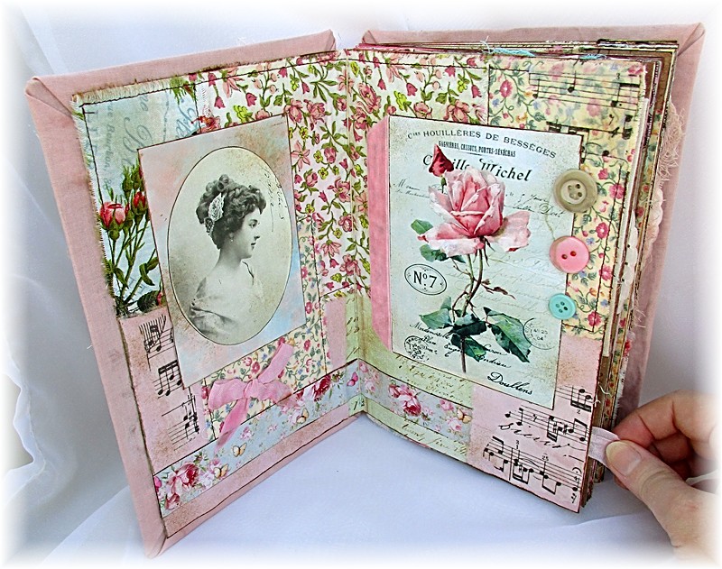
I was so happy with the results that I immediately sat down and started to work on a romantic, shabby-chic, girly, frou-frou, fussy, fluffy book. Using scrapbook paper that resembles old ledger pages as the base, I created nine 9″x18″ spreads, which resulted in a fat little 6″x9″ book. Each page features at least one element that has been avocado dyed. I’m still stoked that this worked so well, and the best part is, you don’t have to worry about caustic chemicals!

The cover is heavy chipboard wrapped in the avocado-dyed cotton fabric, and I’ve added ribbons to the binding threads, made from avocado-dyed seam binding. The seam binding is polyester, so it didn’t take on the dye as easily as natural materials do, but I think the subtle pink is quite lovely!

blush cover

blush p 1

blush p 2

I tend to throw everything plus the kitchen sink on my pages. Every time I came back to a spread that I thought was “done,” I would  reconsider and then add yet another element. (Sometimes it got out of hand.)

blush p 3

Everything was “grunged up” with Tim Holtz Distress Ink to add to the vintage flair.

blush p 4

Many of the pages have scraps of tissue printed with sheet music, which is also a Tim Holtz product. I usually create with whatever is close at hand, and I had a lot of this stuff close at hand.

blush p 5

blush p 6

blush p 7


blush p 9

When I showed this spread to Dude, he didn’t even notice at first that the woman on the left is holding a fluffy white cat. I told him the “story” I made up for this page was that the woman had commissioned an artist to paint a portrait of her cat, which is depicted on the right. Dude said, “Those two cats look nothing alike.” I said, “Of course they do; they’re both white fluffy cats!” After considering for a few moments, he said, “The one on the left isn’t as fluffy.”

blush p 9

Tea-Riffic!

June 27, 2018

Somerset Studio magazine recently asked for submissions of projects made using tea bags. I got the July/August issue in the mail yesterday and was happy to see my canvas titled “Tea with Anna” in their Expressions section!

“Tea with Anna” is one of my favorite pieces I’ve made this year. It looks simple, though it took some planning to work out. The image of a beautiful Victorian lady was printed in parts onto the tea bags, then the bags were pieced together like a puzzle and lightly glued to a piece of padded muslin to form the entire image. I like the effect of the overlapping tea bags and the various colors they produce. It looks like a long-lost family portrait that is starting to fall apart! I sewed some beads that resemble pearls onto several of the bags to mimic hat pins, and mounted the muslin piece onto an 8″x10″ canvas board. The final touch was some delicate coloring with chalks, then it was sprayed with Krylon Matte Finish to set the colors.

tea with anna sm

It was difficult to photograph this to accurately portray its beauty in real life, but as usual, the folks at Stampington did a great job! They also published “Afternoon Tea Sachets” I made by ironing tea bags flat, printing images on them and coloring with chalk, much like the process for this project, with the addition of sewing up the sides and adding cotton rounds with scented oil on them. I keep some of the sachets in my desk drawer at work; it’s always a pleasure to get a whiff of pretty scent when I’m reaching for a paper clip or a highlighter!